Using the WebUI StreamedTable Component
Data presentation in the WebUI
An issue we encountered in the process of developing the WebUI which is particularly relevant in the context of writing a Rucio frontend is streaming. The "old" web frontend (which we want to replace) had the issue that it would freeze on starting larger queries, with no indication as to the progress made or potential errors encountered. Even when everything worked well, these "freezes" could last for up to several minutes in which the page was effectively unusable.
The reason for this was the fact that any responses from the Rucio server (which supports streaming) were stored in a WebUI intermediary, before being forwarded to the client in one batch. Since Rucio responses can be huge (and often, there is no prior indication of the size which a query will take), this could lead to freezing of unknown duration.
The solution would be to pass the stream from Rucio through the WebUI
backend/core to the frontend. This required special software engineering on the
backend, which shall not be covered here. The frontend accesses the streams via
a system called the ComDOM, short for Communication Document Object Model.
It accesses the streams provided by the backend API layer (and NOT the Rucio
server itself) and wraps the data with further tooling (to start/pause/stop the
stream, inspect the state, etc.).
Streamed data is unavoidable in the WebUI. The UI accesses this data in the form
of the ComDOM.
The generic component when dealing with streamed data is the StreamedTable,
which is a custom HTML table framework based on Tanstack
Table and optimized for
use with the streams fed in via the ComDOM. A StreamedTable is defined by a set
of react props passed into the component (which will be described below). The
framework is completed by a plethora of ready-to-use components which solve the
majority of required usecases when it comes to streamed tables.
StreamedTable
The StreamedTable is a fully typed react component based on the HTML table element. The props it takes are defined in the codeblock below.
type StreamedTableProps<T extends BaseViewModel> = JSX.IntrinsicElements["table"] & {
  tablecomdom: UseComDOM<T>
  tablecolumns: any[]
  tablestyling?: TableStyling
  tableselecting?: TableSelecting<T>
}
Explanation
The table expects a stream of elements of type
T, whereTextends theBaseViewModel. In practice, this means that an entity is wrapped in an object providing status and an optional errormessage.The data shown by the table is passed into the
tablecomdomprop as anUseComDOMobject. This object also provides functions to inspect and control the stream. The genericUseComDOMtype is bound to typeT.The table structure (i.e. the way data is structured into columns) is defined by the
tablecolumnsprop. This is essentially an array of column definition objects (which are taken from Tanstack Table), but there are exceptions, which make typing this prop difficult. Most of your time building a streamedtable is spent writing this definition.The first optional prop,
tablestylingis a structure containing style commands for the table. The definition of theTableStylingtype is given below.tableselectingoptionally defines how the user can select (single- or multi-select) elements from the table. It also controls the "breakout" functionality. This is discussed later.JSX.IntrinsicElements["table"]means that the StreamedTable component will return a react component with the HTML<table>tag as its top-level component, which in turn means that any valid HTML table-properties can be passed to the StreamedTable, and these will be passed on to the top-level component. This specifically also includes styling the top-level<table>viaclassNamebut also ARIA-properties.
TableColumns
When creating a new component or editing a new one, it is very useful to view the table in Storybook.
The definition of the tablecolumns can be taken from the
Tanstack Table Documentation.
A simple example shall be discussed here nonetheless. The following code snippet
has been adapted from PageDIDMetadata, with custom styles and most custom
components removed for clarity.
// imports and type definitions
import { createColumnHelper } from "@tanstack/react-table"
type DIDKeyValuePairViewModel = {
    // from DIDKeyValuePair entity
    key: string;
    value: string;

    // from BaseViewModel
    status: 'success' | 'error' | 'pending';
    message?: string;
}

// the streamedtable receives a stream of `DIDKeyValuePairViewModel`
// each element is converted into a row
// initialise the columnHelper to this type
const columnHelper = createColumnHelper<DIDKeyValuePairViewModel>()


// define the tablecolumns array
const tablecolumns: any[] = [
    // Accessor columns have an underlying data model which means they can be
    // sorted, filtered, grouped, etc.
    columnHelper.accessor("key", { // this column accesses the "key" attribute
        id: "key",
        // function to render each body cell of the column, return JSX object
        // "info" contains the value but also other useful context -> read docs
        cell: info => {
            return (
                <span>
                    {info.getValue()}
                </span>
            )
        },
        // funxtion to render header cell of column, return JSX object
        // "info": context useful for the creation of a header cell -> read docs
        header: info => {
            return (
                // this is a custom component that can be placed into the header
                // they are discussed further below
                <TableFilterString
                    column={info.column}
                    name="Key"
                />
            )
        }
    }
    ),
    columnHelper.accessor("value", { // column accesses the "value" attribute
        id: "value",
        cell: info => {
            return (
                <span>{info.getValue()}</span>
            )
        },
        header: info => {
            return (
                // must not use a custom component, a simple <h3> tag is fine!
                <h3>Value</h3>
            )
        }
    })
]
Passing this column definition into a StreamedTable together with the ComDOM supplying the data like so
<StreamedTable<DIDKeyValuePairViewModel>
    tablecomdom={comdom}
    tablecolumns={tablecolumns}
/>
will return a fully functional StreamedTable. This can be expanded upon to create much complex tables with multiple columns.
The StreamedTable is a wrapper for Tanstack Table. In particular, the column definitions have been taken over unchanged. This means that the documentation and examples provided by Tanstack are also valid in the StreamedTables, check them out.
Common components for column headers
A number of reusable components have been added to the StreamedTable package
which can be used to implement frequently-needed functionality such as sorting
and filtering. An example of this has already been given in the code above, in
which a TableFilterString component used.
These components are added in the column header definitions within the
tablecolumns definition, i.e.
columnHelper.accessor("foo", {
    header: info => <TableCommonComponent bar={bar} />,
    ...
})
The remainder of this section will introduce each of the common table components.
TableSortUpDown
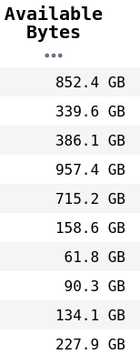
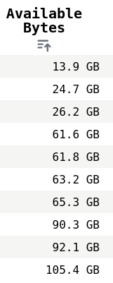
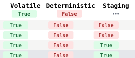
This component toggles the Tanstack Table sorting mechanism on mouseclick and cycles between no sorting, sorting in ascending order and sorting in descending order. Examples of column entries which can be sorted are numeric data and dates.
It takes the following props:
props: JSX.IntrinsicElements["div"] & {
    name: string
    column: Column<any, any>
    element?: JSX.Element
    stack?: boolean
    nocollapse?: boolean
}
Explanation:
nameis the string which will be used as the column header with a default style if noelementis definedcolumnis the table column the header belongs to.elementis the JSX element which overridesname.stackdetermines whether the icon signifying the sorting state and the name element are stacked vertically instead of horizontally. The example picture above uses vertical stacking.nocollapsewill force thename(orelement) to remain visible even on small screen widths (below 768px).- any props valid for a
divelement will also work.
TableFilterDiscrete
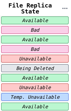
On mouseclick, it cycles through a list of keys and only displays the rows in which the column entry matches the key. Used when the column data is restricted to a small number of options, such as the Rucio enums.

type TableFilterDiscrete<T> = JSX.IntrinsicElements["div"] & {
    name: string, // see TableSortUpDown
    keys: T[],
    renderFunc: (key: T | undefined) => JSX.Element,
    column: Column<any, T>, // see TableSortUpDown
    stack?: boolean // see TableSortUpDown
}
Explanation:
keysis a list of typeTwhereTis the tyoe of the column entries. Usually a string enum.renderFuncis the function used to render the icon to the side or below the text (depending on whetherstateis set).
TableFilterBoolean
A special form of TableFilterDiscrete in which the values are booleans. This
means that no renderFunc needs to be supplied.
// see TableFilterDiscrete
type TableFilterBoolean = JSX.IntrinsicElements["div"] & {
    name: string,
    column: Column<any, boolean>,
    stack?: boolean
}
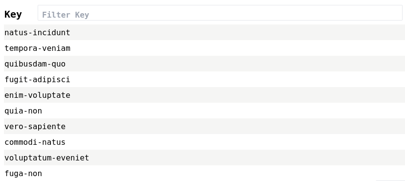
TableFilterString
A filter in which the column entries are strings.

type TableFilterString = JSX.IntrinsicElements["form"] & {
    column: Column<any, string>, // see TableFilterDiscrete
    name: string, // see TableFilterDiscrete
    placeholder?: string,
}
Explanation
placeholderis the placeholder string for the textbox- this component is not derived from
divbut fromform. Any attributes valid informare also valid here.
These common StreamedTable components are very helpful in reducing the complexity of the column definitions you write. They also ensure a common design language throughout the project. We encourage you to use them as much as possible.
Common components for column cells
The selection here is quite limited right now, but shall be extended in order to keep a common design language. It is also much easier to keep the project accessible if the total number of unique components is kept low.
TableInternalLinkfor links within the rucio webuiTableExternalLinkfor links pointing outside of the rucio webui.
TableStyling
As with the rest of the Rucio WebUI, the StreamedTable is styled via Tailwind CSS. This means that styles are constructed by assigning various classes to an element. Tailwind will then compile a minimal set of CSS.
This optional StreamedTable attribute itself only contains optional members. It is used to add to or override table styling settings.
type TableStyling = Partial<{
    visibility?: Record<string, boolean>
    tableHeadRowStyle?: string
    tableBodyRowStyle?: string
    pageSize?: number
    tableFooterStack?: boolean
}>
Explanation:
visibilitymaps a column's visibility (boolean) to the column id (string).tableHeadRowStyle: the classes which shall get passed to thetrin thethead.tableBodyRowStyle: the classes which shall get passed to eachtrin thetbody.pageSizeis how many rows are shown per page at maximum.tableFooterStackwill stack table footer components in order to save horizontal space.
Setting column widths
Column widths are set automatically, but they can be styled individually. This is done by adding a string of class names to the column definition in the following way:
columnHelper.accessor("foo", {
    meta: {
        style: "w-28 md:w-56" // see tailwind documentation for an explanation
    },
    ...
})
The Tailwind compiler has been configured to consider these styles as well when
putting together the minimal set of CSS. Internally, the styles defined here are
applied to the header cell. Since the StreamedTable table element uses
table-layout: fixed, the column widths of the first row will be applied to
each of the following rows as well.
TableSelecting
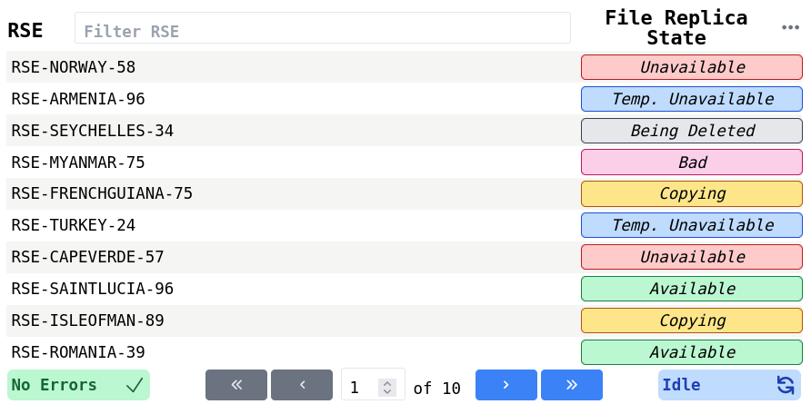
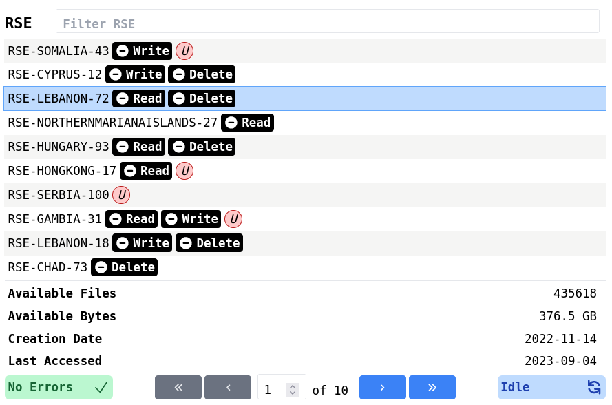
This optional table attribute handles selecting rows and the "breakout". The breakout is an infopanel placed under the table which shows columns for a single selected row (these columns would otherwise be hidden due to lack of horizontal space), see the image below for an example.
type TableSelecting<T> = { // where T is the type of the table rows
    handleChange: (data: T[]) => void,
    enableRowSelection: boolean,
    enableMultiRowSelection?: boolean,
    breakOut?: {
        breakoutVisibility: boolean,
        keys: Record<string, string>, // column id, displayname
    }
}
Explanation:
handleChangeis the function which is run each time the selection state changes.enableRowSelection: whether to enable row selectionenableMultiRowSelection: whether to allow row multi-select (only valid if row selection is enabled)breakout.breakoutVisibility: whether to allow showing the breakout when a row is selected. Often coupled to the horizontal window size.breakout.keys: matching column id to the name under which it is to be displayed. The column ids determine which columns are going to be added to the breakout. Usually, these columns end up being the columns that were hidden due to lack of horizontal space.
NormalTable
The StreamedTable design is part of the design language of the Rucio WebUI, and
we intend for all tables (even if they are non-streaming) to follow this design.
It follows that we created the NormalTable, which keeps the same design as the
StreamedTable but without the streaming capabilities.
type NormalTableProps<T> = JSX.IntrinsicElements["table"] & {
    tablecolumns: any[] // see StreamedTable
    tablestyling?: TableStyling // see StreamedTable
    tableselecting?: TableSelecting<T> // see StreamedTable
    tabledata: T[]
}
Explanation:
tabledata: instead of passing a comdom which wraps the streamed data, we pas the data directly in the form of an array.
StreamedTable in the context of NextJS
The StreamedTable relies on streams, which are rapped in the ComDOM. Until now, we have taken the existence of a functioning ComDOM as given. In this section, we will discuss how to properly embed the StreamedTable in the wider context of the NextJS web application.
The frontend uses the NextJS app router. Look at their docs to learn more.
QueryClientProvider
On a layout-file affecting the route containing the StreamedTable, include the following code:
'use client';
import { QueryClient, QueryClientProvider } from '@tanstack/react-query'

const queryClient = new QueryClient();

export default function RootLayout({children}) {
    return (
        <QueryClientProvider client={queryClient}>
            {children}
        </QueryClientProvider>
    )
}
where children is a React.ReactNode containing the StreamedTable.
Route
On the route which returns the page including the StreamedTable, you must
initialise the ComDOM. You can optionally auto-start the ComDOM query or wait
for the user to trigger it manually -- this will not be covered in-depth here,
since this is more closely related to the ComDOM itself than to the
StreamedTable. An example, taken and adapted from the ListSubscription route,
would be:
'use client';
import { ListSubscription as ListSubscriptionStory } from "@/component-library/Pages/Subscriptions/ListSubscription";
import { useEffect } from "react";
import useComDOM from "@/lib/infrastructure/hooks/useComDOM";
import { SubscriptionRuleStatesViewModel } from "@/lib/infrastructure/data/view-model/subscriptions";

export default function ListSubscription({ params }: { params: { account: string }}) {
    // initialise ComDOM
    const ComDOM = useComDOM<SubscriptionRuleStatesViewModel>(
        "subscription-rule-states-query",
        [],
        false,
        Infinity,
        50,
        true
    )
    // auto-start query, GET data from /api/list-subscription, use param account
    useEffect(() => {
        const runQuery = async () => {
            await ComDOM.start({
                url: new URL("http://localhost:3000/api/list-subscription"),
                method: "GET",
                headers: new Headers({
                    'Content-Type': 'application/json'
                } as HeadersInit),
                params: {
                    "account": params.account,
                }
            })
        }
        runQuery()
    }, [])
    // * return a react component
    // * in this case the StreamedTable is wrapped by a Storybook Page
    // * we pass the ComDOM to this page so that it may be passed further down
    // to the StreamedTable
    return (
        <div>
            <ListSubscriptionStory
                accountname={params.account}
                comdom={ComDOM}
            />
        </div>
    )
}